Transit-oriented development requires more than transit and development
I attend a lot of meetings and read a lot of documents and policy language using the phrase “transit-oriented development,” frequently shortened to its acronym “TOD.” Most of us in the world of smart growth and urbanism love the concept, designed to make it more convenient for more people to use public transportation.
But I have come to believe that many of us are also misusing the phrase and, in the process, failing to be sufficiently ambitious in our advocacy. Example: a coalition NRDC belongs to has been working on proposals to define high-priority development locations, in order to fashion supportive policy. TOD is proposed as one of the categories, and defined in the latest draft by the proximity of the location to transit service. Fair enough; LEED for Neighborhood Development does the same thing, giving credit points for development that is within ¼ mile walking distance of bus transit service or within ½ mile walking distance of rail transit service.
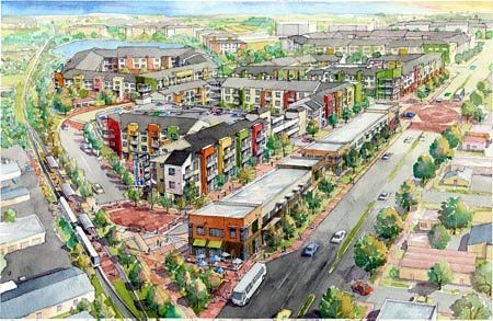
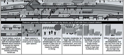
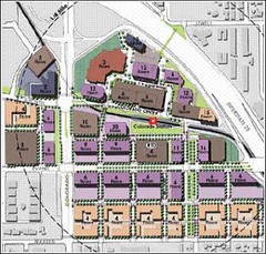
But I would argue that we have really defined only transit-served development locations. The design process of orienting the development to transit requires more. For instance, there must be adequate density and a walkable environment; the densest, most walkable portions of the development should be placed closest to the transit stop; commercial and mixed-use buildings should also be close to the stop, with their primary entrances highly accessible to transit passengers, to facilitate multi-purpose trips; buildings and public spaces should be designed to make the area around the transit station or stop feel inviting, comfortable, and secure; design should make it easy for transit and bicycle transfers and vehicle drop-offs; single-family residences may be placed a bit farther away; and so forth. While placing development near transit is good, orienting the development to the transit is better, and more effective for creating a sustainable, well-functioning community.
Now, I’m not a designer, and I’ve already told you about as much as I really know about what makes TOD work. But, fortunately, you needn’t be constrained by my limited expertise: A large number of resources are available to flesh out the topic.
For example, you can consult the handy and informative Station Area Planning Manual prepared in 2007 by Reconnecting America for the San Francisco Bay Area. The 36-page manual provides design and policy guidance for seven types of transit stations from city and suburban centers to neighborhoods to corridors. (Paragraph bite: “In order to create a station area that encourages transit use and TOD, the public space around stations must be inviting and usable. A successful public space is easy to walk through, is comfortable to sit and visit, and has attractive features such as water fountains and public art. Great public spaces often include retail . . .”) I was recently reminded of the publication by an interesting post concerning parks and public spaces near transit, written by Ben Welle on the Trust for Public Land’s City Parks Blog.
To cite just a couple of the many additional publications available, Minnesota’s Metropolitan Council, serving the Twin Cities region, has produced a Guide for Transit Oriented Development that is excellent as a shorter, less technical overview (Sample caption: “Attractive pedestrian environment, with street-facing buildings and a network of pedestrian-scaled streets connecting the transit stop or station with the TOD’s commercial, civic and residential areas.”).
One of the better PowerPoint presentations I have seen on the subject was prepared by PB Placemaking for a transit corridor in the City of North Las Vegas (“TOD planning principles: greater density than community average; a mix of uses; quality pedestrian environment; a defined center”).
Straying for a moment from the subject at hand to venture into the world of personal pet peeves, I have to say that I find myself one of a dying breed in my love of and insistence upon precise, descriptive language. That’s a tempting but dangerous rant for me to begin here, so I won’t, but let’s just say that it isn’t by accident that I found my way to law school back in the day. And I offer TOD as exhibit A for my case that thinking carefully about why we use particular phrases and words can make a difference, and in this case an improvement, in thinking about how to improve our communities.
Kaid Benfield writes (almost) daily about community, development, and the environment. For more posts, see his blog’s home page.

