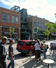
For walkability and community, put the building on the street and the parking in back
The misplaced assumption that Americans like automobile traffic more than walkable streets has created some pretty awful disconnections within our communities. One of them has been the unfortunate dogma that places (and in some cases requires) parking lots in front of the businesses, civic institutions and apartment/condo buildings buildings that they serve, between the buildings and the street. This creates longer and more dangerous walking routes for pedestrians as well as a visual incoherence that is anti-community. It also makes public transit less attractive and viable, since the transit user's journey from the bus stop to the store or apartment must take place through a sometimes-large parking lot instead of simply to a door on a sidewalk.
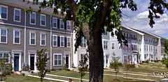
It was disheartening to see this recently on a tour of Congress Heights (photo above), a revitalizing urban neighborhood in DC's Ward 8, across the Anacostia River from the heart of the city, and one of the city's poorest. Many Congress Heights residents do not own a car, or only own one for a household with two or more adults. The neighborhood is well-served by both bus and rail transit, though.
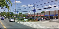
The tour was mostly good news involving encouraging redevelopment, pleasant densification, and restoration of the neighborhood fabric. Part of the good news – and it is very good indeed – is that Congress Heights finally got a Giant supermarket two years ago, after going for more than a decade without a supermarket. The bad news is that it was built to a very suburban, automobile-oriented configuration, a long way back from the street. There are also some nice-looking, neighborhood-serving businesses on the same site but they, too, are separated from the neighborhood by parking:
The row of new townhomes that you see in the photos is directly across the street from the Giant and the neighborhood services and businesses. But residents on foot can't get to shopping or the bank branch, for instance, without walking to the end of a long block, crossing the street, and then navigating their way through the parking maze, dodging traffic along the way. I'm sure the result is that, if they have a car, they just drive, even if they don't need to carry a lot of groceries on their errand. If they don't have a car, they are just inconvenienced, which is a shame.
The configuration was criticized by urbanist commenters (see also here), but I was told by my hosts on the tour that the neighborhood simply didn't have much leverage in the talks with Giant over the design of the site. If they wanted a supermarket, they were going to have to accept the company's suburban model, and they did. I don't really blame them, and in fact I'm really glad they now have their store. But I hope that as the neighborhood continues to redevelop it will find ways to improve its walkability for residents and visitors.
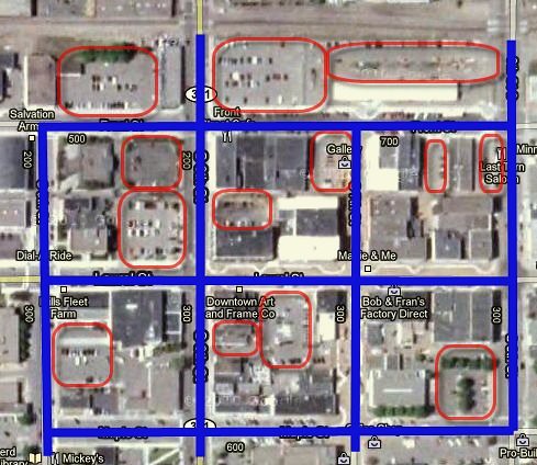
The effect of parking lots on the walkability and feel of a community was the subject of a recent post by Charles Marohn on the Strong Towns Blog. This is the central area of Brainerd, Minnesota, where he lives, with parking lots marked in red:
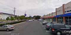
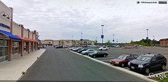
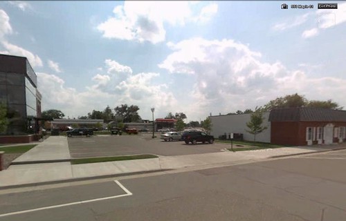
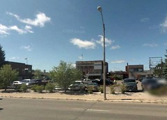
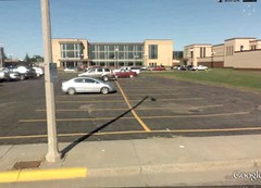
Below Charles's delineation of the parking lots in Brainerd are street views of some of them that I retrieved from Google Earth. Note how in one of the photos there appears to be no sidewalk, and in another (the large one) there is a small business that fronts the street, a lonely orphan given the prominence of the much larger parking lot next door:
"[Parking in Brainerd] occupies prominent, valuable real estate. In fact, one of the two most important intersections in the city - the intersection of Laurel and South 6th - is 1/4 parking. (Unfortunately another 1/4 of this intersection is a brick wall building that looks like a jail. The other half of the intersection is one of the best coffee shops around and a retail location with revolving tenancy).
"Not only does all this parking underutilize the infrastructure, generate relatively nothing in tax revenue, employ no people and occupy some of the best real estate in the city, but it also detracts from the public realm. Brainerd just sunk millions into making their downtown more pedestrian friendly, but without addressing all of the sense-of-place-destroying gaps created by surface parking, the downtown is still struggling to create that sense of vibrancy."
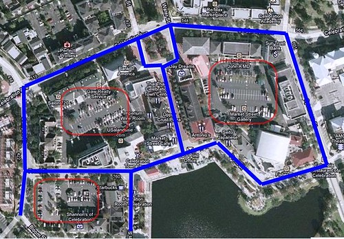
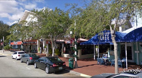
Charles contrasts the situation in Brainerd to that in the planned new town of Celebration, Florida, below:
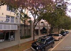
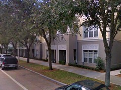
Celebration puts its parking in the rear, creating a far different and more cohesive feel to its streetscape. While it must be said that Celebration has the considerable advantage of being planned from scratch and supported with a huge investment of corporate money, the principle is still well-illustrated: you can put just as much parking in back as in front, but the result when you do is far more inviting to pedestrians and conducive to having a "there" there, as someone once said. Brainerd will have incremental opportunities to repair its town fabric, and it should take advantage whenever possible.
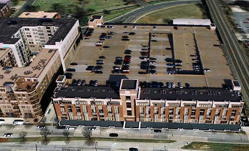
Larger communities can be even more ambitious, using street-facing homes and businesses to hide entire multistory parking structures behind them:
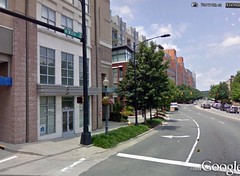
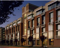
Above is a 2,800-car parking garage that serves over a million square feet of office space in Charlotte, North Carolina's Gateway Village. You don't see it from the street, though, because it is lined front and back with a mixed-use project called Gateway Lofts, comprising 52 homes and 8 ground-floor retail spaces. Here is what you see from the street:
Gateway Lofts, designed by Charlotte's David Furman, won a design award from the North Carolina AIA chapter. The Lofts and the rest of Gateway Village are in an older, once-industrial part of the city that is seeing a lot of redevelopment, close to Charlotte's uptown central business district.
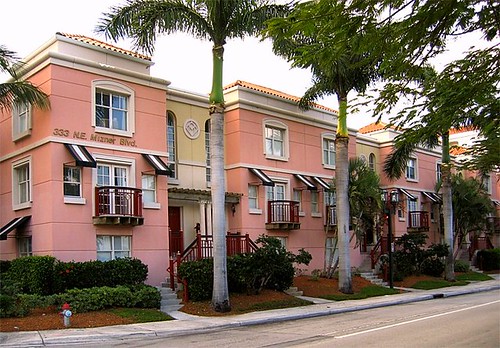
Here are two more examples, from Boca Raton, Florida, left, and Boulder, Colorado, right. The Mizner Park townhomes in Boca hide a surface parking lot behind. The mixed-use buildings in Boulder mask a multistory parking structure:
Back to supermarkets, Seattle-based planner Mark Hinshaw and Portland-based market analyst Brian Vanneman believe that the wave of the future is street-based markets that anchor rather than hinder walkability in a neighborhood. The two explore the subject in the March 2010 issue of Planning:
"[M]any grocery corporations are rethinking their business model, giving up the long-standing template of a single-story box surrounded by acres of asphalt. Increasingly, these markets are going into mixed use developments with little or no parking . . .
"In the past, the lack of parking was often cited as a factor that kept markets out of urban neighborhoods. This is because for decades markets assumed that every customer would arrive by car. But this view seems to be changing rapidly as well. Some recent markets have provided only a few dozen stalls, far fewer than the standard rule of thumb. Some provide no parking at all. And these stores are doing quite well . . . [The IGA market in downtown Seattle is] one of a growing number of urban markets that cater to shoppers who carry two bags of groceries out by hand every few days, rather than transporting 10 bags by car twice a month. Buying fresh also means buying more frequently."
(The Planning link requires a subscription, but Neal Peirce summarizes the article on Citiwire.)
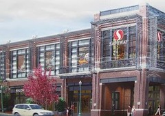
Some advocates might just wish that cars would go away entirely, or that communities make it so inconvenient or costly for their drivers that they dwindle in number. But, for most places, that isn't realistic and could even be counterproductive, chasing businesses out of central cities and exacerbating sprawl at a time when we should be doing the opposite. What we can realistically do is to make sure our buildings and streetscapes are fully supportive of environment- and community-friendly modes of travel. Placing the parking to the rear still allows access for drivers while attracting more walkers and transit users in front.
Kaid Benfield writes (almost) daily about community, development, and the environment. For more posts, see his blog's home page.
Link to original post


